
You approve a tin sample, place the order, and open the first production carton to find that the brand green looks duller than you remember. The artwork has not changed. The supplier says the same color was used. Yet the finished packaging does not look quite like the piece you signed.
To reduce color differences between tin samples and mass production, the approval needs to cover what gives the finished tin its appearance: the metal beneath the ink, the print and finish, and the way the formed pack is compared. For custom tin packaging buyers, the useful starting point is to establish what changed before asking the printer to adjust the color.
Consider that green lid again. Where the difference appears helps you decide what to investigate.
Only when the lid is tilted
The finish or reflection may be involved.
Across the flat panel, under the same light
The print and base deserve a closer look.
Only at a drawn corner
The investigation moves toward forming.
Those distinctions make a color discussion much more useful than simply asking for “a better match.”
A sample should not be approved by color alone.
Its identity needs to stay connected to the metal base, print method, varnish, formed condition, and artwork revision. Otherwise, a perfectly acceptable sample can become an unclear target for the order that follows.
When Everyone Is Matching a Different Reference
A buyer may send a brand guide, a paper proof, and a tin from an earlier order, expecting them to describe the same color. The printer may see three slightly different targets.
A correction that brings the sample closer to the paper proof could move it farther from the old tin, so the disagreement needs resolving before sampling becomes a series of competing adjustments.
For a critical brand color, a controlled physical reference is more useful than a phone image. A recognized spot-color reference can provide a starting point when the project uses spot ink, but a paper color chip does not reproduce the full appearance of ink and varnish on metal. Confirm the final target with the supplier on a representative tin sample.
| Reference item | What it can approve | What it cannot prove alone |
|---|---|---|
| Artwork file | Color definitions, separations, revision status | Final appearance on metal |
| Paper proof | Layout, image balance, general color direction | Metal reflection or final varnish |
| Printed metal sample | Substrate, ink, coating, visual result | Forming effects when the sample is still flat |
| Signed master sample | Accepted appearance for the recorded specification | Unrecorded changes or a complete acceptance tolerance by itself |
For a logo, a physical chip may be the starting color target; for the surrounding metallic background, an approved printed tin may be the more relevant reference. The brief should make that priority clear.
If the final metal sample is accepted with a difference from the original chip, that agreement needs to travel with the sample. Otherwise, the chip can reappear at goods-in inspection and reopen a decision everyone thought was settled.
The most recognizable part of the pack also deserves the most attention. A small photographic shadow and a dominant green brand panel need not carry the same acceptance priority. Identifying critical and non-critical zones
gives the supplier a clearer idea of where a visible difference would affect the finished pack most.
The Color Starts Beneath the Ink
The same ink build can look different over an opaque white base and over a surface that leaves the metal visible.
Over a white base
The ink receives a more neutral background, although white opacity and finish still affect the result.
With the metal visible
Without that white layer, reflection from the metal becomes part of the design.
Here, exposed metal means the substrate remains visible through or beside the printed design; it does not necessarily mean an unprotected surface. Tinplate has a silver-colored metallic appearance. If a project needs a gold-toned effect, specify the coating, ink, or other treatment that creates it rather than assuming gold is the natural base color.
Suppose a green logo is first sampled over white, then part of the background is changed to reveal the metal. An ink adjustment made for the first version may no longer give the intended result.
This is why the base map belongs ahead of final color tuning
: full-white, partial-white where specified, and exposed-metal areas need to be settled and linked to the artwork revision.
If a logo crosses two base treatments, both areas need to appear on the representative sample. A color chip shows the target color, but it cannot show the effect of each layer sequence on that tin. The useful conversation with the supplier is therefore about where the white sits beneath the artwork and which metallic areas are intentional.
Where a Spot Color Helps
Spot color for a critical solid
For a large solid logo or signature background, a dedicated spot ink can make the important color easier to control. That is a useful reason to discuss it with the printer, especially when the same branding appears across several packs.
CMYK for images and gradients
Photographs, gradients, and multicolor illustrations generally suit CMYK, although a bright monitor color may fall outside the chosen process gamut. Both routes still depend on the base, ink film, varnish, and curing conditions.
A hybrid approach is often useful: a signature green can use a spot reference while surrounding imagery remains CMYK
. For related artwork versions, retain the same separation logic unless a change is deliberately reviewed. Switching one version from a spot ink to a CMYK simulation introduces a new matching task before normal production variation is considered.
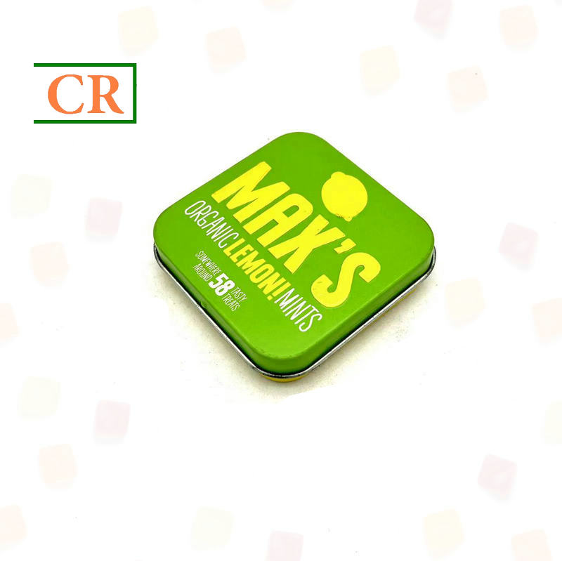
A Large Brand Panel Makes the Choice Visible
On this Mints Tin Case
, the broad green lid is a good example of an area a buyer may want treated as color-critical. With artwork like this, a clear patch away from lettering and edge highlights gives the master and production pieces a consistent comparison point.
The choice between spot color and CMYK should be discussed around that finished artwork.
How Finish and Shape Change the Color You See
A glossy lid and a matte side panel can appear different even when the underlying ink is similar. Gloss produces stronger directional reflections; matte finishes scatter light differently. A change in varnish can therefore alter apparent depth, brightness, or saturation without a change to the artwork file.
This matters when a buyer likes the color of a glossy sample but decides to order a matte finish. The change needs a fresh appearance review
; the earlier approval does not establish how the matte version will look.
The same applies to a glossy logo over a matte background. That contrast can be part of the design, provided its position and intended effect are recorded with the sample.
Baking and curing affect the final coating film. The correct settings depend on the ink and coating system, so a universal temperature or time is not a useful buying specification. Confirm that the sample represents the agreed production process and compare pieces at the same specified stage after curing and cooling.
A side-by-side comparison is more revealing when both tins start in the same orientation and are then rotated together. A mismatch that changes strongly with angle suggests that finish or geometry is contributing.
A difference that stays visible across comparable flat areas calls for a closer look at the ink, base, and coating conditions. Neither observation establishes the cause on its own, but it helps avoid an unnecessary ink correction.
Corners and drawn walls need separate attention. A local change may come from reflection, but forming can also stretch the printed or coated surface
and create a real appearance change. Compare the corresponding formed zones on the master and production pieces, and use a retained flat print where available to help isolate when the difference appeared.
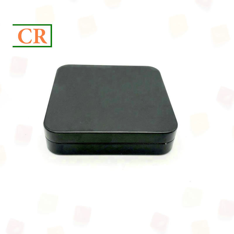
The Lid and Edge Can Tell Different Stories
The Flip Top Hinged Square Tin Case
has a broad lid and rounded perimeter that can be compared as separate areas on a finished sample. If your artwork continues toward the edge or sidewall, a good match in the center of the lid is only part of the review.
The corresponding curves need attention too, particularly when a dark solid color makes changes in reflection noticeable.
What Your Sample Approval Actually Covers
“Approved” is a small word that can carry several different meanings. The buyer may mean the spelling and layout are correct, while someone farther along the project treats the email as approval of the finished appearance. Separating content approval from color, finish, and formed-sample approval
prevents that ambiguity from reaching production.
There is also a practical question behind any attractive prototype: how was it made? A sample produced by a different printing route may be useful for judging structure or artwork placement without establishing the final production color.
The supplier should be able to explain whether the substrate treatment, ink and varnish systems, curing, and forming represent the route intended for the order.
If there is a difference, identify it before signing. Record what the sample can approve and what further confirmation is required on the intended production route. The important question is whether the approved appearance can be reproduced under the conditions that will make the order.
The approval record can remain short, provided it connects these parts of the agreed sample:
Artwork
Final text, graphics, orientation, and artwork revision.
Printed appearance
Accepted base coverage, spot colors or CMYK balance, and varnish.
Finished sample
Curves, corners, embossing, and artwork crossing between components, linked to the sample identification, date, and authorized sign-off.
One active standard does not have to mean one tin shared between several locations. Buyer and factory can retain agreed, matching reference pieces with traceable identification. Keep obsolete masters separate, and review changes to artwork, white-base boundaries, finish, or other relevant conditions before carrying approval forward.
How Close Is Close Enough?
The factory and the buyer can reach different conclusions if one compares under a controlled light and the other beside a window. Agreed lighting, neutral surroundings, and consistent sample positions give the primary comparison a repeatable basis.
Retail lighting can be an additional review condition when it matters to the project; it should be discussed before it becomes the reason for rejecting an order.
Even under the same light, the signed master gives a target rather than a complete answer to “how close is acceptable?” That is a separate agreement covering the critical areas, visual acceptance criteria, and who can authorize a deviation. Mutually approved boundary samples can be useful when a physical example explains the acceptable range more clearly than a description.
If color measurements are part of acceptance, agree on the instrument method, measurement geometry and settings, measurement locations, color-difference formula, and limits. A bare “Delta E” number is incomplete.
Reflective and curved areas require an appropriate measurement approach and visual assessment; a reading from an unrelated flat area cannot settle the appearance of an entire tin.
Keeping the Approved Color Through a Full Order
The move from one approved sample to a full order is where the agreement has to become a production reference. The artwork revision, sample identification, base map, and finish notes need to describe the same version. If a newer file has arrived since sampling, its approval status needs resolving before production is adjusted to match an older piece.
The first production pieces
For a buyer, the first useful checkpoint is the representative output from the intended production route. Comparing those first pieces with the active master allows a mismatch to be caught before the run continues under the agreed release procedure. If the design crosses formed areas, that review needs finished tins as well as any flat-print controls, assessed at the specified stage after curing and cooling.
Coverage across the run
A good first piece does not establish the appearance of every later carton.
Sampling needs to cover the run, with pieces identified by batch or production period so a developing change can be traced.
The appropriate number and inspection intervals depend on the order and its color-critical areas. It is worth asking how that coverage will work before placing the order, rather than discovering at delivery that only the initial pieces were compared.
Changes during production
Material changes, relevant process adjustments, and a restart after a stoppage are points to assess for renewed checks under the agreed plan. If the lid and body come from different production groups, compare them as a complete pack as well as checking each component separately.
Why Repeat Orders Need Both the Master and the Last Batch
Master sample
Defines the approved target.
Retained production samples
Document what an accepted run delivered.
Keeping both makes repeat orders easier to review without gradually replacing the original standard with whatever was shipped most recently.
A retained tin is much more useful when its label leads back to the batch or production period, date, and acceptance status.
The associated record should connect the approved artwork and master to the acceptance criteria, white-base map, spot-color references or CMYK notes, varnish specification, and relevant curing or process records.
For a repeat order, a record of changes, deviations, and corrective actions can explain why the previous run was accepted. Keeping the approval with that history also avoids asking the next production team to reconstruct a decision from a loose tin and an old photograph.
Protect retained samples from conditions that could alter their appearance, and check their condition before reuse. Photographs can help locate a defect or identify a batch, but camera exposure, lighting, and screens make them unsuitable replacements for the physical reference.
When the Delivered Tins Look Different
Back at the receiving desk, “the color is wrong” tells the supplier very little about the affected order. A more useful description is that the green has shifted in hue, looks less saturated across the lid, has a different gloss, is uneven in a solid area, or is lighter only around a formed corner.
Before drawing that conclusion, the comparison needs the active master and the agreed light; an old sample can create a false mismatch.
A dull-looking logo may involve the varnish. A metallic zone that appears unexpectedly heavy may call for a check of white coverage or the base condition. A corner that remains lighter when corresponding surfaces are compared needs a forming review. These are starting points for investigation, not diagnoses that can be confirmed from appearance alone.
A Useful Diagnosis Narrows the Problem
The affected locations and production period help establish the scope. A difference across comparable flat areas puts the metal base, white-underprint coverage, and spot-color or CMYK route under review. A change concentrated in the surface appearance brings varnish type, gloss consistency, and the curing records into the discussion.
When the problem follows a curved or drawn zone, a retained flat print can help show whether the difference appeared before or after forming. That does not make every corner mismatch a stretching problem, but it provides a more useful comparison than adjusting the whole print to compensate for one edge.
One suspected cause should lead to one controlled correction.
The corrected piece is then compared with the existing approved standard before another variable changes.
Changing the ink, white layer, and varnish together may improve one piece while hiding the cause. A controlled correction leaves a clearer explanation of what changed and makes the next run easier to reproduce.
The Batch Decision Matters as Much as the Correction
Once a critical area is outside the agreed acceptance criteria, the immediate concern is which stock is affected. Separating questionable output while keeping accepted pieces identifiable
preserves the option to review, sort, or otherwise resolve the affected range.
Batch and time records make that decision more precise; mixing the pieces into accepted cartons makes it much harder.
Record the symptom, confirmed cause, correction, affected batch, and authorized disposition. Retain a corrected piece as evidence of the action.
It becomes a new master only if a change to the target is explicitly approved
; a successful correction should normally return production to the existing standard.
For a repeat order, review that history before making fresh adjustments. The last accepted batch can help explain previous production behavior, but it should not silently override the active master or the agreed tolerance.
Questions Buyers Ask About Color Matching
Will a spot color eliminate sample-to-production differences?
No. A dedicated spot ink can simplify control of a critical solid, but white coverage, ink film, varnish, curing, and the formed surface still affect the result. Approve the complete appearance and retain the same agreed print route for repeat production.
Can a sample made by a different printing method approve mass-production color?
It can support the approval tasks it represents, such as layout or structure. If its process does not represent the production route, agree on a further color check using that route before treating it as the final color standard.
What if the color reading passes but the tin still looks different?
Check that the reading uses the agreed formula, settings, and measurement area. Compare gloss, reflection, and formed zones under the agreed visual conditions. Resolve the mismatch through the combined acceptance procedure rather than changing a numerical limit after the problem appears.
Does a corrected production sample replace the signed master?
Not automatically. Retain it with the correction record and check it against the existing target. Replacing the master or changing the accepted appearance requires explicit approval and an updated, traceable specification.
Discuss the Color-Critical Areas of Your Tin
If a particular brand color is central to your packaging, show us where it appears on the tin. A large lid panel, a logo crossing a curved edge, and a color shared between lid and body give the sampling discussion different priorities. The same details help when you are reviewing a mismatch or planning a repeat order.
To make that discussion specific, send:
- The tin model, dimensions, or product link
, and whether this is first sampling, a repeat order, or a production issue. - The artwork revision and brand-color reference
, with the most color-critical areas marked. - The intended white-base and exposed-metal zones
, gloss or matte direction, and any selective varnish or embossing. - For an existing mismatch:
master-sample identification, batch details, affected locations, and photographs that help locate the issue. Physical samples may still be needed to assess color.
The next conversation should establish what the sample will approve, which production conditions it represents, and how the order will be compared with it. If the structure is still undecided, explore the available tins first, then discuss the artwork and its most important color areas on the shape you are considering.
Post time: Sep-09-2026