
A custom tin box can carry a crisp raised logo on screen yet behave very differently once the metal starts moving. Before sampling, relief artwork needs to be checked against the real panel, rolled edges, corner radii, hinge areas, fold zones, reverse-side clearance, and printed graphics. As a result, the strongest design usually comes from reviewing structure and decoration together rather than treating embossing as a final artwork effect.
The practical answer
Before relief tooling begins, confirm the usable panel, relief direction, edge clearance, fold clearance, fine-detail legibility, reverse-side geometry, print registration, and the acceptance points for the physical sample.
The safest relief design is not automatically the smallest or shallowest option. Instead, it is the layout that gives the metal enough room to move while preserving the important parts of the artwork. A broad logo in a stable lid center can be easier to control than a smaller logo pushed close to a radius.
Meanwhile, a flat PDF cannot show the full result. Embossing creates slopes, highlights, shadows, and reverse-side geometry. Debossing creates the same type of engineering questions in the opposite visual direction.
In practice, the review sequence matters. Confirm the tin structure before fixing the relief position. Then confirm the relief concept before making close print alignment a non-negotiable design feature.
Relief direction changes the panel
Embossing vs Debossing in a Tin Project
Tin embossing raises selected artwork on the viewing side. Tin debossing presses selected artwork inward. Although the visual effect differs, both operations reshape the metal rather than adding a separate decorative layer.
Consequently, both sides of the panel deserve attention. A raised mark outside creates related geometry inside, while a recessed outside area affects the reverse surface in another direction. That relationship can matter near an insert, product tray, hinge, sliding component, or another metal surface.
|
Raised surface EmbossingA practical choice for a bold wordmark, monogram, emblem, frame, or icon that benefits from light, shadow, and touch. |
Recessed surface DebossingA suitable option when the mark should feel quieter or sit below the surrounding panel while keeping a tactile surface. |
Relief direction should follow the finished structure
A logo file alone cannot answer whether raised or recessed artwork is more practical. The decision depends on the panel that carries the logo. A large flat lid behaves differently from a short hinged lid, a sliding cover, or a panel surrounded by a pronounced shoulder.
For example, a compact tin handled in one hand may place a thumb close to the opening edge. Relief near that area can feel different during repeated opening. Meanwhile, a display tin with a broad top panel may allow the relief to sit farther away from all moving features.
As a result, visual preference should come after the structural check. The design can still aim for a strong tactile effect, but it should do so inside a panel that can support the intended geometry.
Map the safe forming zone
Usable Logo Area and Edge Clearance
The printable panel and the relief panel are not always the same area. Printed backgrounds may extend toward edges where raised or recessed metal would become more difficult to control. Edge clearance should therefore be judged from the real forming boundary rather than only from the visible outer perimeter.
Typical boundaries include lid shoulders, corner radii, rolled edges, curls, seams, hinge zones, beads, locking details, and sidewall transitions. In addition, the tooling transition around a raised shape occupies more space than the visible vector path itself.
No single edge-clearance number applies to every tin. Panel shape, relief area, corner geometry, depth, nearby structure, and tooling approach can all change the workable zone. Consequently, generic limits should not replace review against the current dieline.
A useful pre-sampling check
Place the relief artwork on the latest structural drawing. Then mark temporary keep-out zones around corners, folds, shoulders, hinges, seams, curls, and moving parts. If the intended logo depends on entering one of those zones, the position should be reviewed before tooling.
Corners need more attention than a flat drawing suggests
A rectangular logo can look comfortably centered in artwork while its outer corners approach a formed radius. Once the lid takes shape, those regions are no longer flat. A circular badge can create the same problem when its outer ring follows the general lid shape too closely.
Accordingly, relief clearance should be checked around the complete perimeter. One side may have generous space while a hinge side or rounded corner creates a local restriction.
Optical centering also matters. A mathematically centered logo may not look centered when a hinge, opening edge, or asymmetric structural feature changes the visual balance. A small positional adjustment can sometimes improve both appearance and manufacturability.
When the format is still being selected, the metal packaging range can provide useful structural references before the relief layout is fixed.
Compare real forming conditions
Three Tin Structures Worth Checking Before Relief Sampling
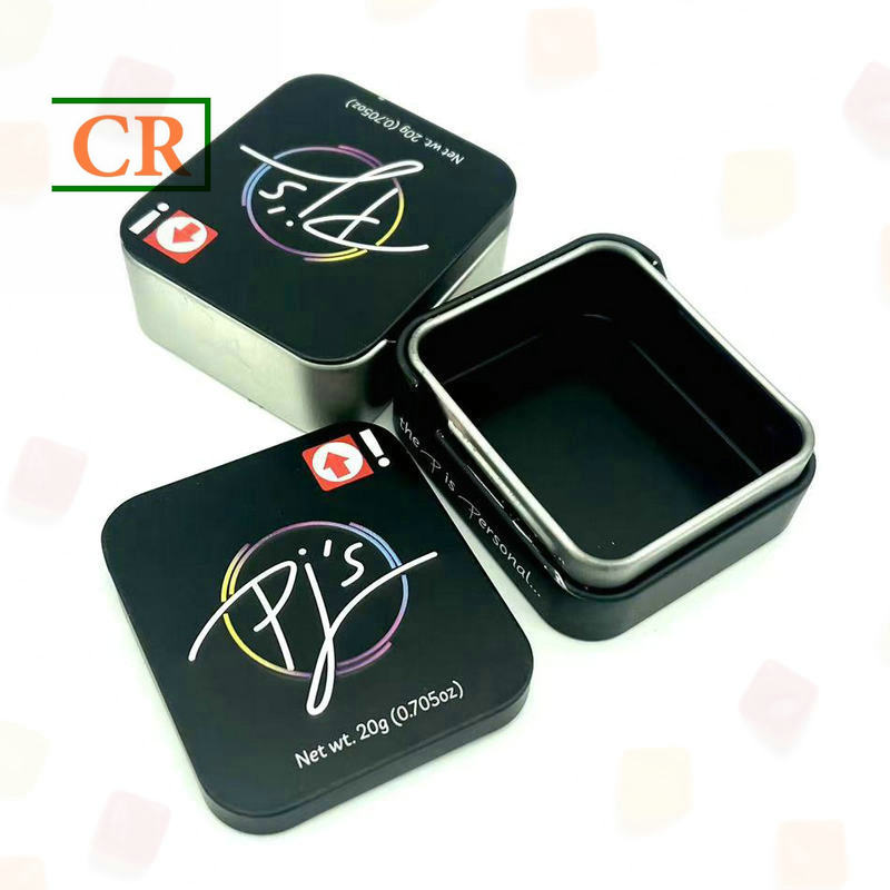
Relief limits become easier to discuss when artwork sits beside a real structure. A sliding lid creates different keep-out areas from a hinged case. Meanwhile, a compact square lid puts more attention on corner radii and the hinge side.
The examples below are structural references rather than universal embossing templates. Each project still needs its own approved dieline, intended logo position, and physical sample review.


Protect the readable parts of the mark
Fine Text, Narrow Gaps and Fold-Line Risks
Small text is not controlled by font size alone. Stroke width, counters, letter spacing, serif detail, internal corners, and relief depth all influence whether lettering remains clear after forming.
For example, a bold sans-serif wordmark may contain wide strokes and open internal spaces. A script logo at the same overall height may contain narrow joins, tight curves, and small counters. Consequently, the second mark can require much more careful tooling review.
Narrow negative spaces create a related problem. When two raised features sit very close together, the metal has less room to form a clean valley between them. The physical sample may then show softened gaps or details that appear heavier than the vector artwork.
Separate printed detail from formed detail
A useful artwork strategy is to prepare a dedicated relief layer. The printed identity can keep small descriptors, fine illustration, subtle texture, and thin decorative rules. Meanwhile, the embossing layer can concentrate on the dominant shapes.
This separation also improves hierarchy. A tactile emblem can attract the hand and eye, while printed secondary information remains clean and readable. In many cases, fewer formed elements create a stronger result than raising every line in the artwork.
Strong relief candidatesPrimary symbols, broad wordmarks, simple badges, large monograms, and clean borders with generous spacing. |
Review carefullyNarrow rings, tight scripts, tiny counters, thin strokes, sharp internal notches, and closely spaced logo components. |
Often better in printSmall descriptors, instructions, legal copy, codes, fine rules, and information that depends on precise line weight. |
A fold line is a forming zone, not a hairline
Fold clearance deserves the same attention as edge clearance. A bend shown as one line on the dieline occupies a real zone once metal starts moving. Material stretches and compresses around the bend radius.
For that reason, embossing across a fold is a higher-risk choice. A broad decorative texture may tolerate some visual change, while a letter stem or narrow logo outline can distort enough to become noticeable.
Likewise, curls, seams, and drawn sidewalls already require controlled forming. Keeping critical relief away from those areas usually gives the artwork a more stable surface.
Depth changes more than height
Depth, Metal Deformation and Print Registration
Depth is usually the first thing people notice in an embossing mock-up. A deeper mark casts a stronger shadow, but it also asks the tinplate to move farther from its original plane. That movement is not distributed evenly: a broad solid emblem, a narrow letter stroke, and a tight internal corner place different demands on the same panel.
This is why a depth setting should not be copied from another design. The result depends on the shape being formed and the construction around it. A shallower relief with clean, well-defined edges can look more intentional than a deeper mark that softens fine details or makes the surrounding panel appear uneven.
Before increasing depth for a stronger effect, look closely at the smallest features in the logo. If they begin to lose definition, extra height is adding visual drama at the expense of the mark itself.
Digital sharpness does not equal metal sharpness
On screen, a vector logo can have a perfectly sharp internal corner. Once that shape is formed in metal, the corner may need a small radius or softer transition so the material can take the shape cleanly. The effect is easiest to see in tight notches, narrow counters, and pointed joins.
The design question is not whether every corner can remain mathematically exact. It is which contours make the logo recognizable. A small internal notch may accept a slight adjustment; the outer silhouette of a familiar symbol may not.
Keeping the defining outline intact while simplifying a low-value detail can preserve the brand mark without asking the metal to reproduce every pixel of the vector file.
Print registration becomes more visible beside relief
Print registration is the accuracy with which the printed artwork lands in its intended position. The issue becomes more noticeable when a thin outline is designed to follow the wall of a raised logo: the eye compares the two edges directly, so even a small shift can make one side look heavier than the other.
A color break placed exactly where the relief begins creates a similar risk. If the printed boundary and the formed edge do not meet as planned, the difference can look like a design defect rather than a minor production variation.
The layout is more forgiving when the raised emblem sits inside a broader printed field. The relief and print still need to be coordinated, but the design no longer depends on two narrow boundaries meeting perfectly.
A useful artwork test
Imagine the printed graphic moving slightly relative to the relief. If the design immediately appears incorrect, registration is carrying too much visual responsibility and deserves extra attention before sampling.
Relief changes light and surface appearance
How Printing and Finish Interact with Relief
Printing and relief share one visible surface. Once the panel rises or recesses, it reflects light from new angles. Solid colors, metallic-looking areas, matte finishes, gloss finishes, and fine patterns can therefore look different across the formed geometry.
Gloss areas often create sharper highlights along a raised edge. Matte areas can soften that effect. Meanwhile, dark solid colors may make edge highlights especially visible under direct light.
Consequently, finish decisions should be evaluated on the formed sample rather than only on a flat proof. The artwork may look balanced on screen while the physical relief becomes the strongest visual element under normal lighting.
View the sample like a real package, not a studio image
A simple handling test reveals a great deal. Place the sample on a desk, pick it up, rotate the lid, and view it from several normal angles. Highlights will move across the raised and recessed areas as the panel turns.
During this check, a recessed word may become less visible at one angle. At another angle, a reflective raised emblem may dominate the printed information around it.
This does not automatically mean the relief is wrong. Instead, it shows why physical sample approval should consider the complete surface under realistic viewing conditions.
Keep functional graphics on stable areas
Barcodes, QR codes, date areas, small instructions, and other functional graphics depend on predictable shape and contrast. Steep relief can change viewing angle, reflection, and local spacing.
Accordingly, these elements generally benefit from a stable flat area. Decorative branding can tolerate shadow because shadow is part of the intended effect. A machine-readable code has much less freedom.
The same logic applies to small informational copy. When a fine line of text crosses several relief levels, its apparent weight can change. Separating information from decorative forming usually creates a cleaner approval target.
What the limits look like in real handling
Practical Scenarios That Reveal Embossing Problems Early
Engineering limits become clearer when the discussion moves away from abstract artwork. The same logo can behave very differently on a small sliding case, a hinged rectangular box, or a wide presentation lid.
The following situations help a project team identify what needs attention before tooling. They do not replace sample validation, but they make the pre-sampling conversation more specific.
|
Pocket-size format A logo near a sliding edgeA thumb repeatedly pushes the lid during opening. Relief placed too close to the moving edge may look crowded or sit inside an area already controlled by the sliding structure. |
Hinged format A wide logo near the hingeThe logo may appear centered when the lid is closed, yet its rear edge can approach the hinge zone. Reverse-side relief should also be checked when the lid opens fully. |
Display format An outlined emblem on a broad lidA large panel gives the relief more room, but a thin printed outline around the emblem can still make registration variation highly visible. |
In each case, the problem is not simply “too much embossing.” The risk comes from the relationship between relief geometry and another requirement: movement, structural clearance, or printed alignment.
That distinction helps keep revisions focused. Instead of shrinking every logo automatically, the project team can change the specific feature creating the conflict.
Turn the sample into an approval reference
Sample Approval Checklist
On the first sample, it is easy to focus on whether the logo looks attractive. But a close-up can hide the problems that matter once the tin is handled: the mark may sit too near a hinge, lose definition at normal viewing distance, or create unwanted contact on the reverse side.
Review the sample in the order the package will be judged. First check the logo’s position against the lid and its structural features. Then look at the formed edges, fine detail, print alignment, and finish. Finally, open, close, or slide the tin as the design requires.
The physical tin—not a photograph or flat proof—should decide approval. Artwork remains useful for comparing position and revisions, but only the formed package shows how the relief catches light, how the lid moves, and whether nearby surfaces remain clear.
1
Position & structureCheck orientation, optical centering, edge clearance, fold clearance, hinge zones, seams, corners, and nearby moving parts. |
2
Relief & surfaceCheck line definition, counters, narrow gaps, corners, broad fields, reverse-side geometry, print registration, and finish appearance. |
3
Handling & sign-offOpen, close, slide, stack, or assemble the format as relevant. Record the exact sample and artwork revision approved. |
A practical seven-step inspection
- Match the revision. Confirm that the sample corresponds to the latest dieline, printed artwork, and relief layer.
- Check placement before depth. Compare the logo with panel centerlines, corners, edges, hinges, and printed landmarks.
- Inspect fine detail. Look closely at counters, narrow gaps, thin strokes, internal corners, and small isolated features.
- Inspect the reverse side. Check whether the relief creates unwanted contact with inserts, packed items, or nearby metal parts.
- Review print registration. Compare outlines, color blocks, and finish boundaries with the formed feature from normal viewing distance.
- Rotate the sample under light. Watch how highlights and shadows change across matte, gloss, metallic-looking, and solid-color areas.
- Test normal handling. Open, close, slide, or assemble the structure and note any interference near the relief.
Do not approve only from close-up photographs
Photos are useful for recording revisions, but relief depth and reflective finish change with viewing angle. When a physical sample is available, it should remain the main tactile and visual approval reference.
Information worth preparing before sampling
A useful sampling brief is not necessarily a long technical document. It is a shared reference that lets the designer and factory look at the same version of the same package. The artwork should show which parts are printed, which parts are formed, where the relief sits on the chosen structure, and which details must remain unchanged.
- Editable vector logo artwork.
- Separate relief layer showing the exact formed shapes.
- Latest dieline with intended position and orientation.
- Clear note stating raised or recessed direction.
- Printed artwork showing any close-registration outlines or color breaks.
- Finish notes where matte, gloss, or metallic-looking areas interact with relief.
- Insert or internal clearance information when relevant.
- Notes identifying brand-critical shapes that should not be simplified or moved.
Keep these materials tied to one clearly marked revision. Older files can remain in the project archive, but they should not be mixed into the active sample package; otherwise, the sample may be checked against a version that is no longer current.
Decide what to change before resampling
What to Adjust When the First Relief Concept Looks Risky
A concern raised on the first sample does not automatically mean the whole logo needs to be smaller. The problem is often local: a flourish reaches into a corner radius, a narrow counter loses its opening, or a printed outline sits too close to a raised wall. Identifying the specific conflict makes the revision more precise and helps preserve the parts of the mark that carry recognition.
If the logo sits well on the panel but one outer flourish enters the formed corner, shortening that flourish may be enough. The wordmark can keep its size and position while only the feature causing the conflict is adjusted.
Final pre-sampling check
Three Actions Before Relief Tooling
Embossing and debossing work best when structure, artwork, print, and physical sampling are treated as one system. A flat file cannot show every radius, reverse-side projection, reflection, or registration effect.
- Map the real forming zone. Check corners, edges, hinges, folds, seams, curls, shoulders, and moving areas before fixing the logo position.
- Protect the important geometry. Simplify secondary detail before compromising the main emblem, wordmark, or recognizable shape.
- Approve the complete interaction. Review relief, reverse-side clearance, print registration, finish, and normal handling on the same physical sample.
Common engineering questions
FAQ
Can embossing cross a fold line?
It is a higher-risk layout because the fold and the relief both require controlled metal movement. Critical letters and narrow logo features are usually easier to preserve on a stable panel. If a design must cross the bend, the exact forming zone and the physical sample should be reviewed before approval.
How small can embossed text be?
No single minimum applies to every typeface and tin structure. Stroke width, counters, spacing, corner geometry, relief depth, and surrounding negative space all affect readability. The actual vector lettering should be reviewed rather than relying only on nominal font size.
Does embossing affect print registration?
Relief can make small registration differences easier to see, especially when a thin outline or color boundary follows the formed edge exactly. Broader print areas, deliberate spacing, or independent boundaries can create a more forgiving design.
What should be checked on the sample?
Check relief location, edge and fold clearance, small-detail definition, reverse-side geometry, surrounding panel condition, print alignment, finish appearance, and normal opening or closing. The physical sample should also match the approved artwork and dieline revision.
Request a sample
Check Manufacturability Before Relief Tooling
A concise review package can include the logo file, intended relief location, target tin style, raised or recessed direction, and printed elements that need close alignment. This gives the engineering review a clear basis for identifying forming conflicts before a sample tool is approved.
For a custom tin box sample, send the current logo, target position, and preferred structure for a manufacturability review. Edge conflicts, fold-line risk, fine-detail concerns, reverse-side interference, and registration-sensitive artwork can then be checked before the physical sample becomes the approval reference.
| Send Artwork for Review → | Compare Tin Structures |
Post time: Nov-01-2026